Bip — Creating the world's first digital credit experience

Next gen disruption
Next gen disruption


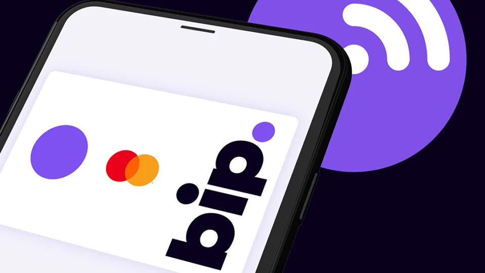
Bip is the world’s first pure-play digital credit experience, created to redefine credit and unlock its benefits for the next generation.


When the Bip team asked us to help accelerate their new product, we imagined a category from scratch. Free from legacy systems, plastic cards, paper bills and complicated T&Cs. Through a process of customer persona mapping, defining our audience and workshopping strategy, we envisioned a brand that was disruptively simple and future-first.
By working in partnership with Bip from the outset, we had the opportunity to shape product and brand at the same time. A symbiotic relationship that influenced every stage of the customer experience. This informed an innovative design system that blurs the boundaries between brand expression and experience design.
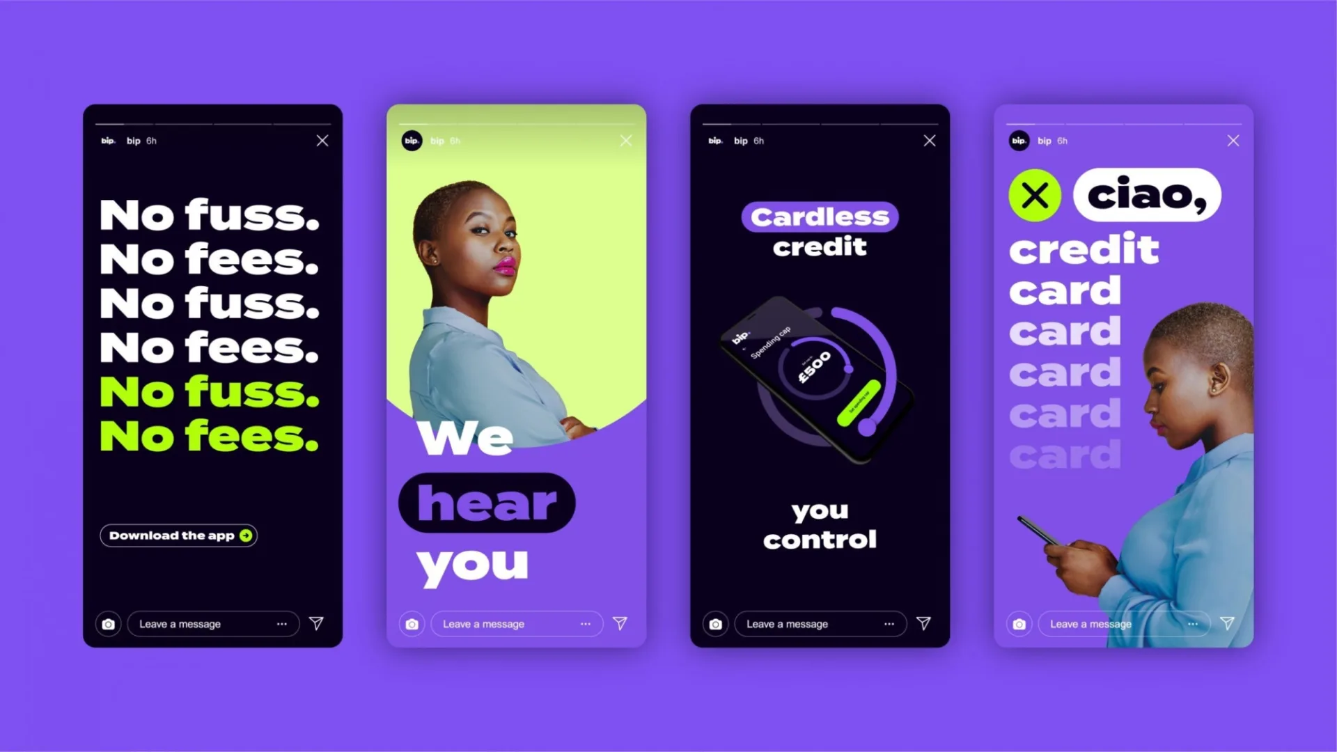
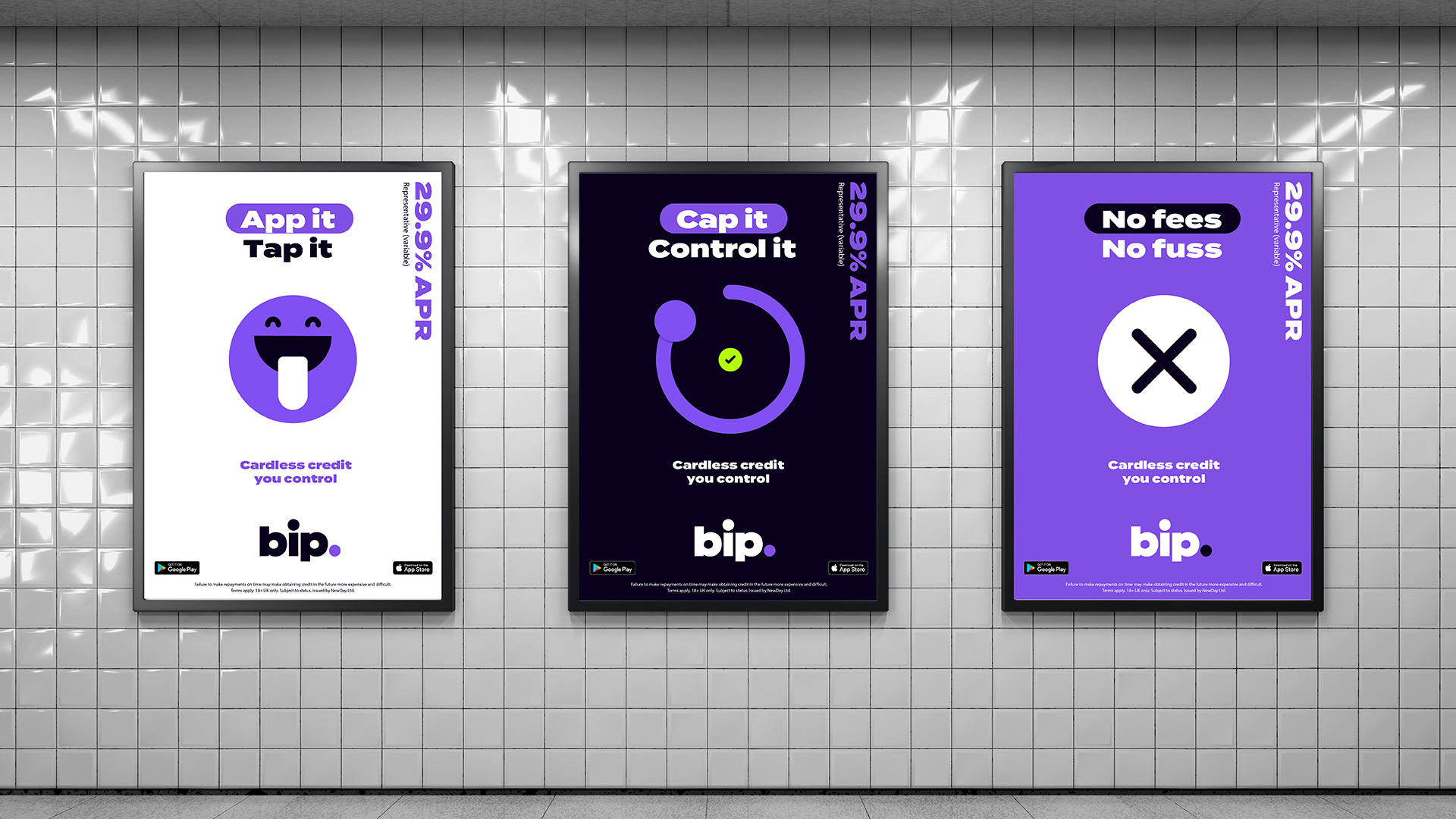
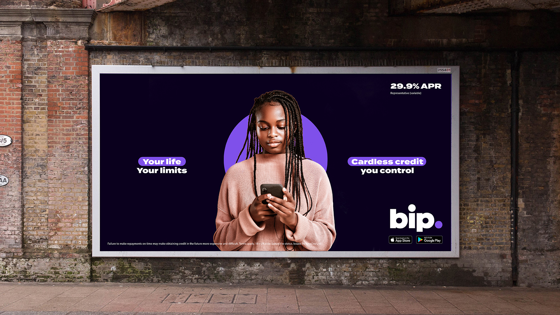
Bip is powered by a disruptive creative idea, where every element of the brand is a metaphor for this new digital credit experience. Starting with the brand name we created, Bip, signalling the immediacy of digital credit. Translating into a holistic sonic brand palette, envisioned to accompany core moments in the experience. And flowing through the UI, seamlessly connecting users to credit and putting them in control.
 A UK first, empowering a generation
 failed by traditional credit.
UK
