Sky Broadband — A brand identity built for entertainment


Built for entertainment
Sky Broadband is the UK’s fastest-growing broadband provider. It ‘Believes in better’ for in-home connectivity. We were asked to evolve its brand identity to bring to life the fact that Sky Broadband is the only provider ‘Built for Entertainment’.

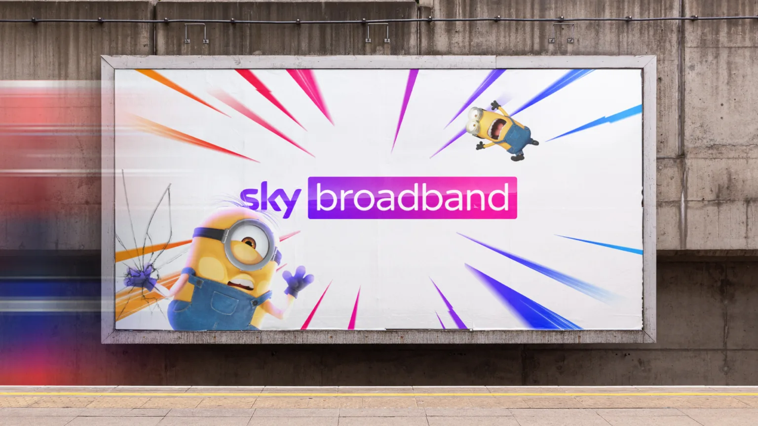
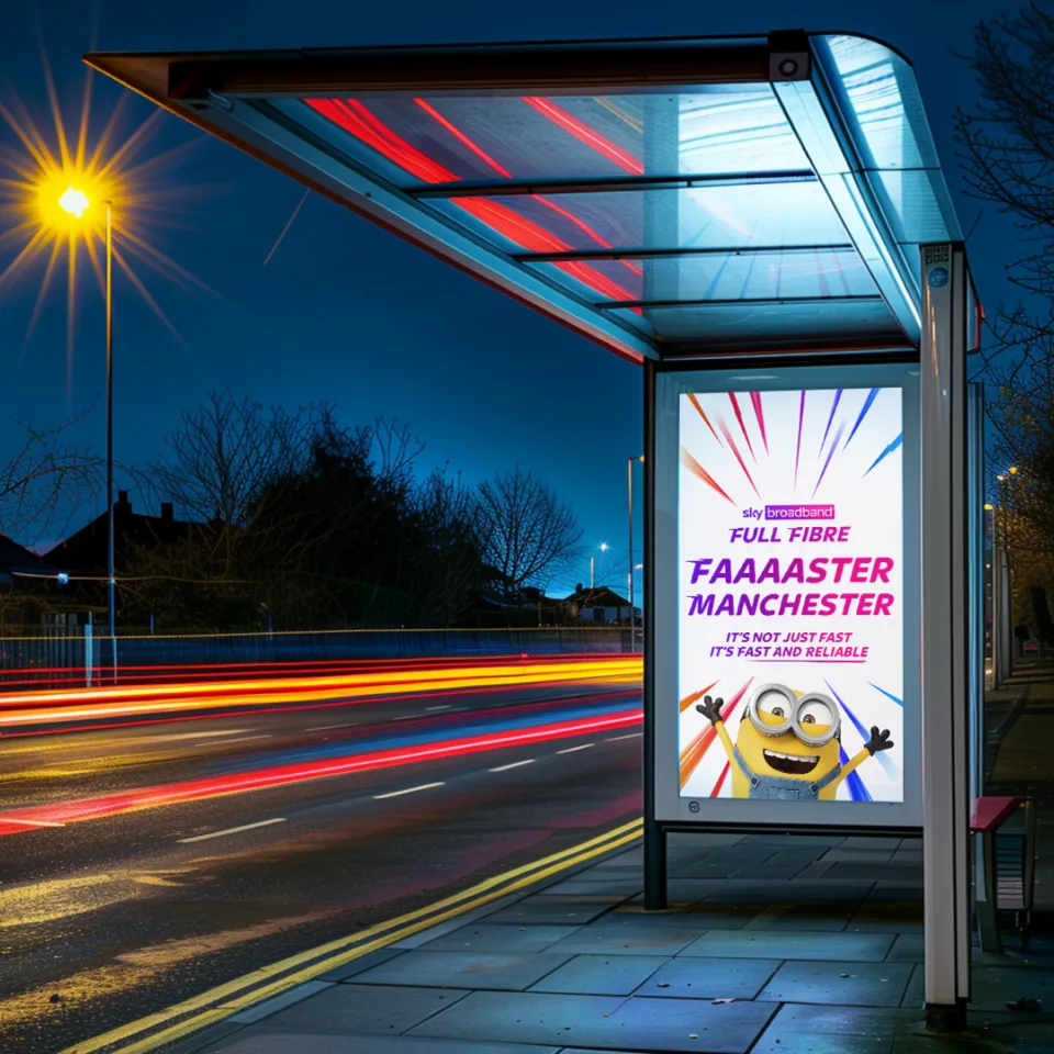
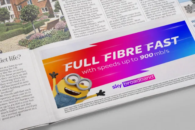
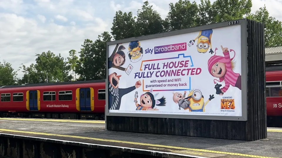
The need for speed
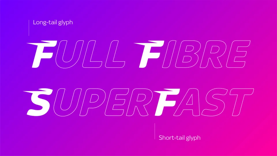
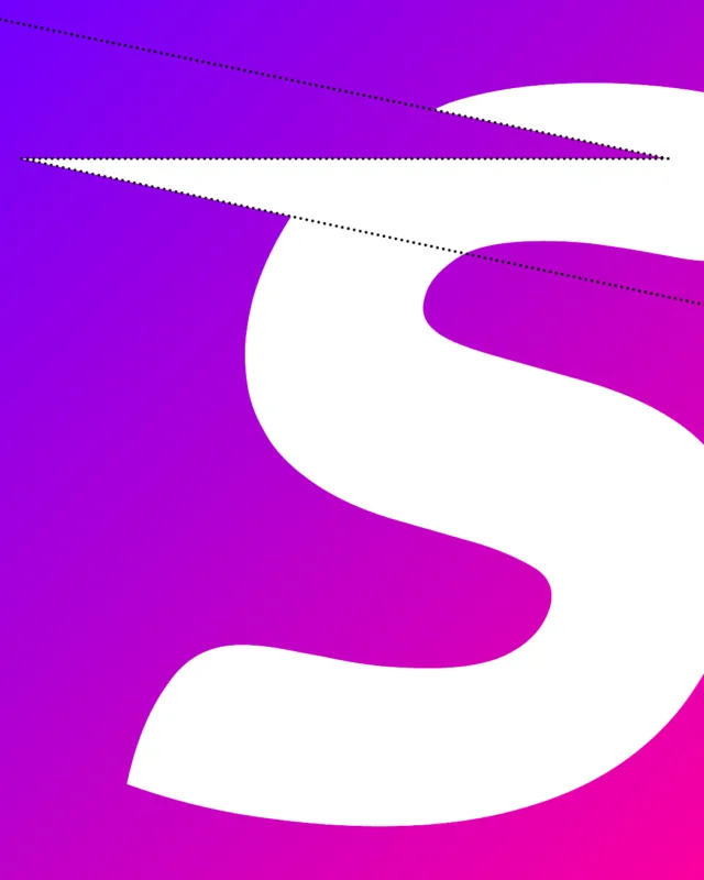
Speed is still the highest priority for broadband customers. So we wanted every touchpoint to feel fast. To do this we developed a bespoke ‘go faster’ cut of Sky’s brand font. This speedy typeface includes custom, dynamic glyphs.
Warp factor
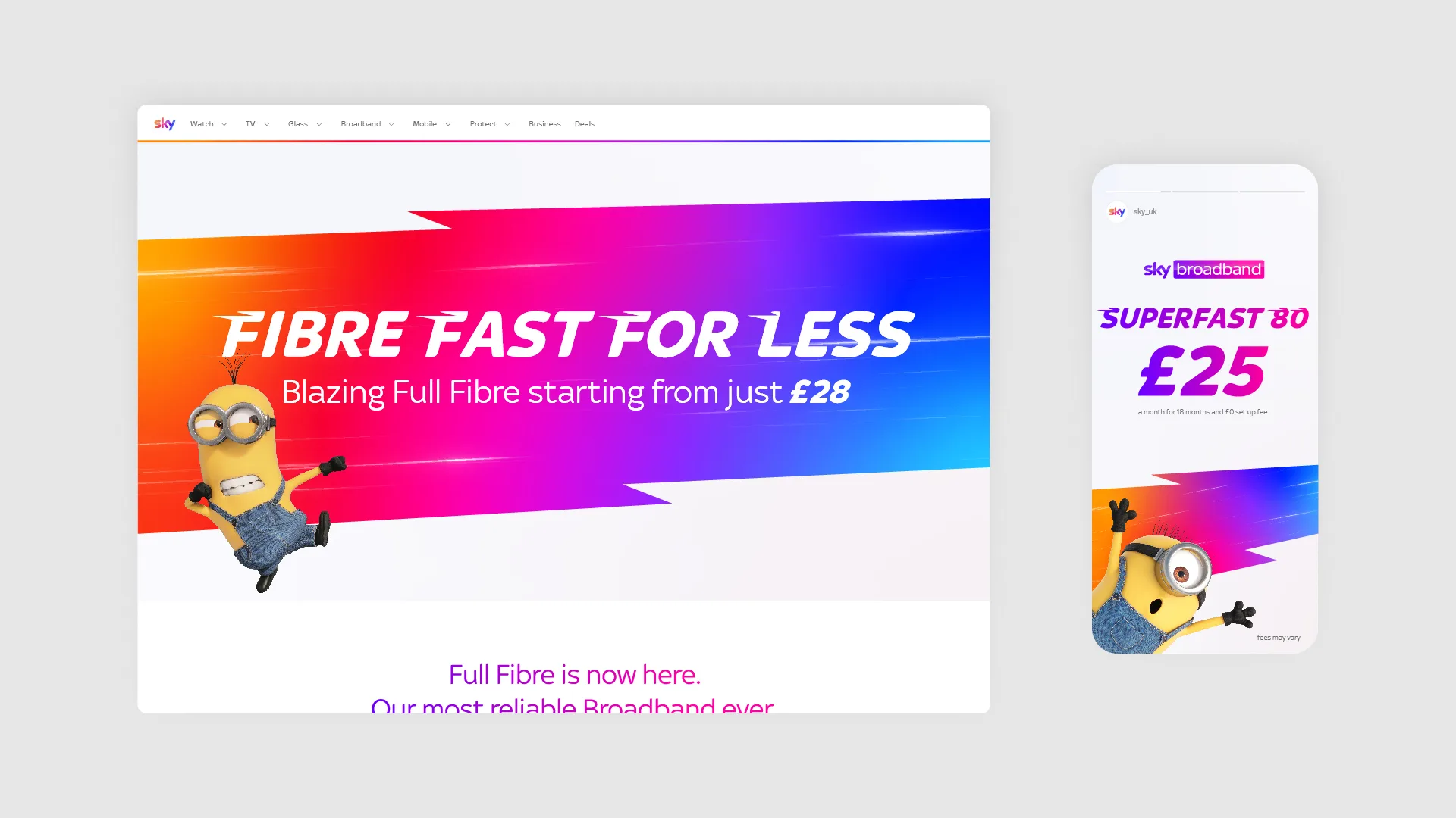
Lightning-fast broadband should look lightning fast. We introduced a spectrum ‘Speed Warp’, to show off headline copy in an unmistakably Sky way.
Bolt beyond
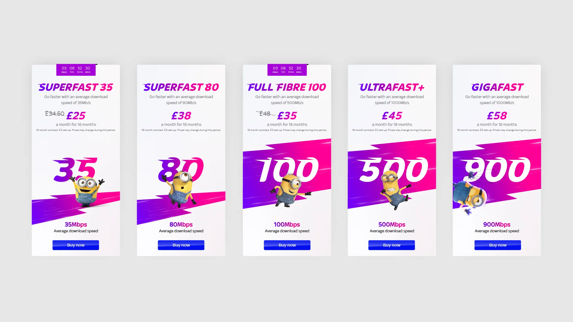
A single ‘Speed Bolt’ creates a distinctive and eye-catching backdrop to signpost different packages and cut through in ever-evolving digital spaces.
Get connected
As well as making our design world feel faster, we evolved the WiFi symbol that, in conjunction with the Minions, expresses in-home connection.
Max factor
The new identity is designed to flex. So, when Sky WiFi Max, the Ultra HD of WiFi, came along, we turned the look and feel up to the Max, filling the home with entertainment, whether you’re in the attic or the annexe.